
Transforming the Face of First Aid Training
Since its inception in 2017, Life Saving First Aid has been at the forefront of empowering individuals across Melbourne and Victoria with life-saving skills. With a mission to make First Aid accessible to all, they have successfully trained thousands of people.
Since its inception in 2017, Life Saving First Aid has been at the forefront of empowering individuals across Melbourne and Victoria with life-saving skills. With a mission to make First Aid accessible to all, they have successfully trained thousands of people.
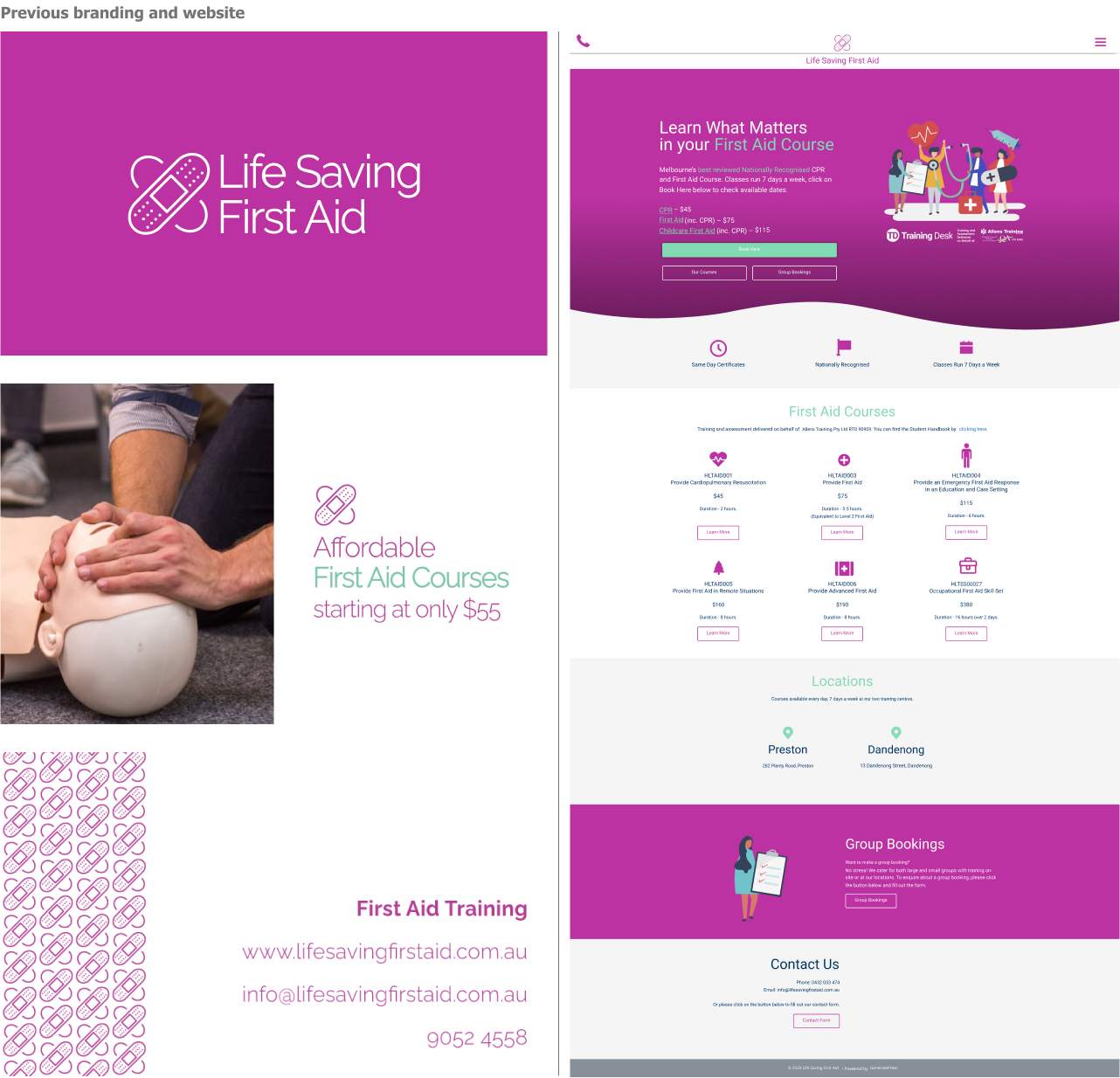
First impressions mattered
When potential students and businesses visited the Life Saving First Aid website, many often left quickly, assuming it wasn’t a reliable business. The website's design and branding failed to inspire trust, resulting in missed opportunities.
When potential students and businesses visited the Life Saving First Aid website, many often left quickly, assuming it wasn’t a reliable business. The website's design and branding failed to inspire trust, resulting in missed opportunities.
New approach
As the Solo-Lead designer, my objective was clear: to craft a brand from scratch that would set Life Saving First Aid apart from its competitors and recover the trust of its customers. I aimed to create a modern and distinctive identity that struck the perfect balance between educational, positive, and empowering.
After running some customer interviews and understanding their opinions and feelings about the previous branding, I embarked on a journey to transform their online presence and establish a brand that resonated with both existing and prospective clients. The new branding was meticulously crafted to communicate a sense of authority, positivism, and friendliness using the heartbeat as the main element.
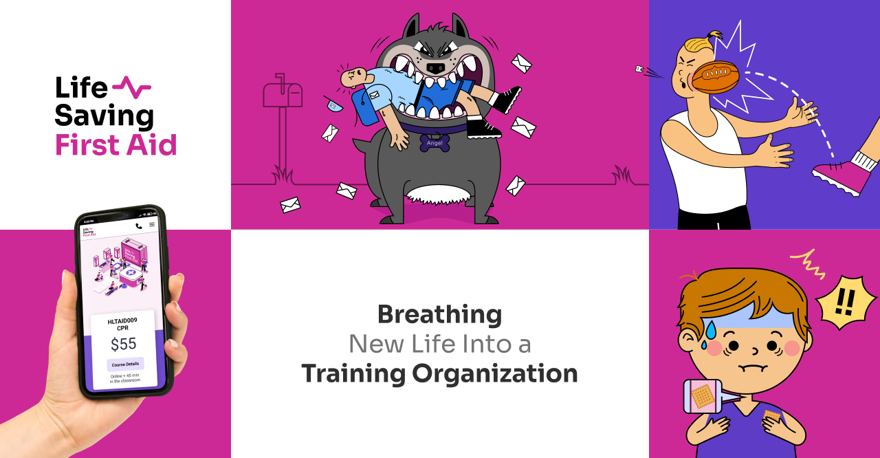
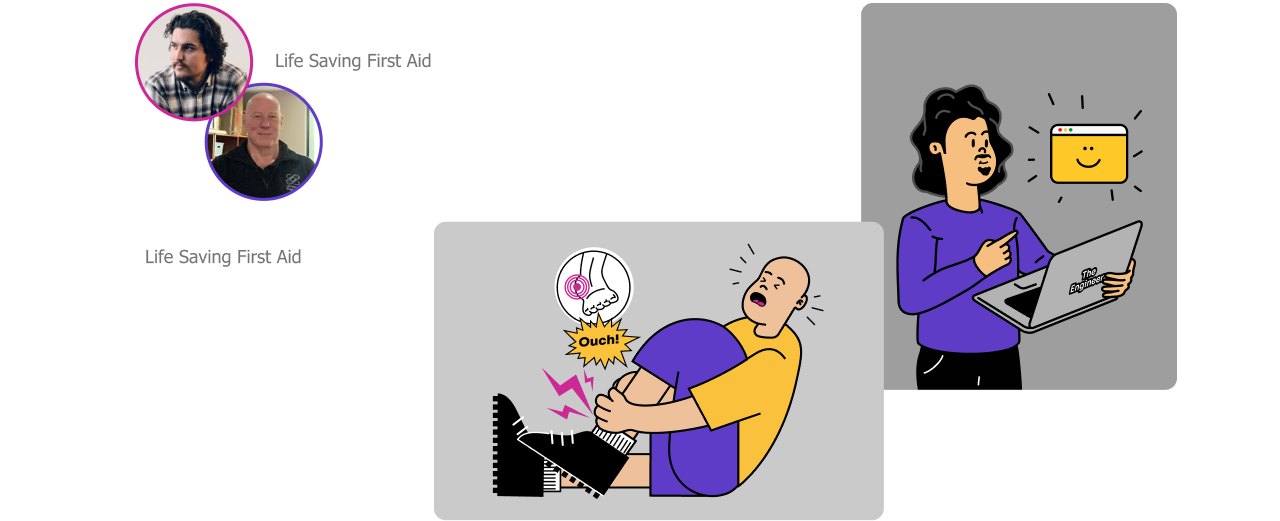
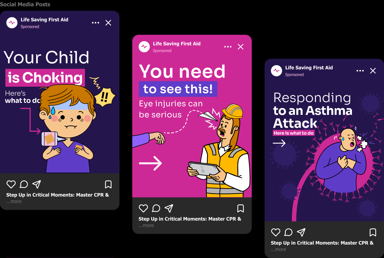
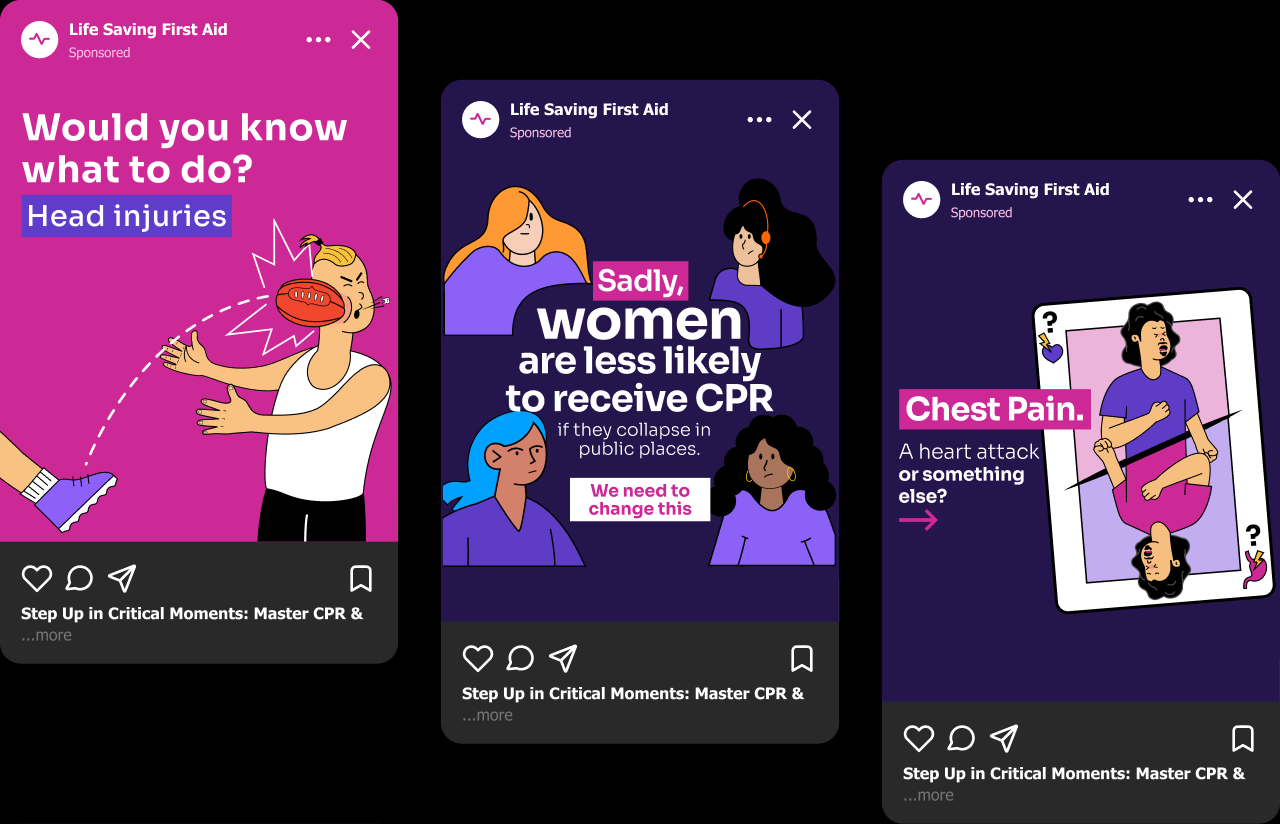
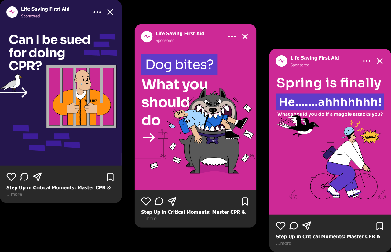
Staff-Inspired Illustrations
The idea behind the illustrations was to bring to life unique characters based on the trainers and team members that work at Life Saving First Aid. By incorporating our actual staff members as the characters, a strong sense of belonging was fostered within the company. These personalised illustrations created a deeper connection, showcasing the team's expertise and enhancing the overall company identity.
The idea behind the illustrations was to bring to life unique characters based on the trainers and team members that work at Life Saving First Aid. By incorporating our actual staff members as the characters, a strong sense of belonging was fostered within the company. These personalised illustrations created a deeper connection, showcasing the team's expertise and enhancing the overall company identity.
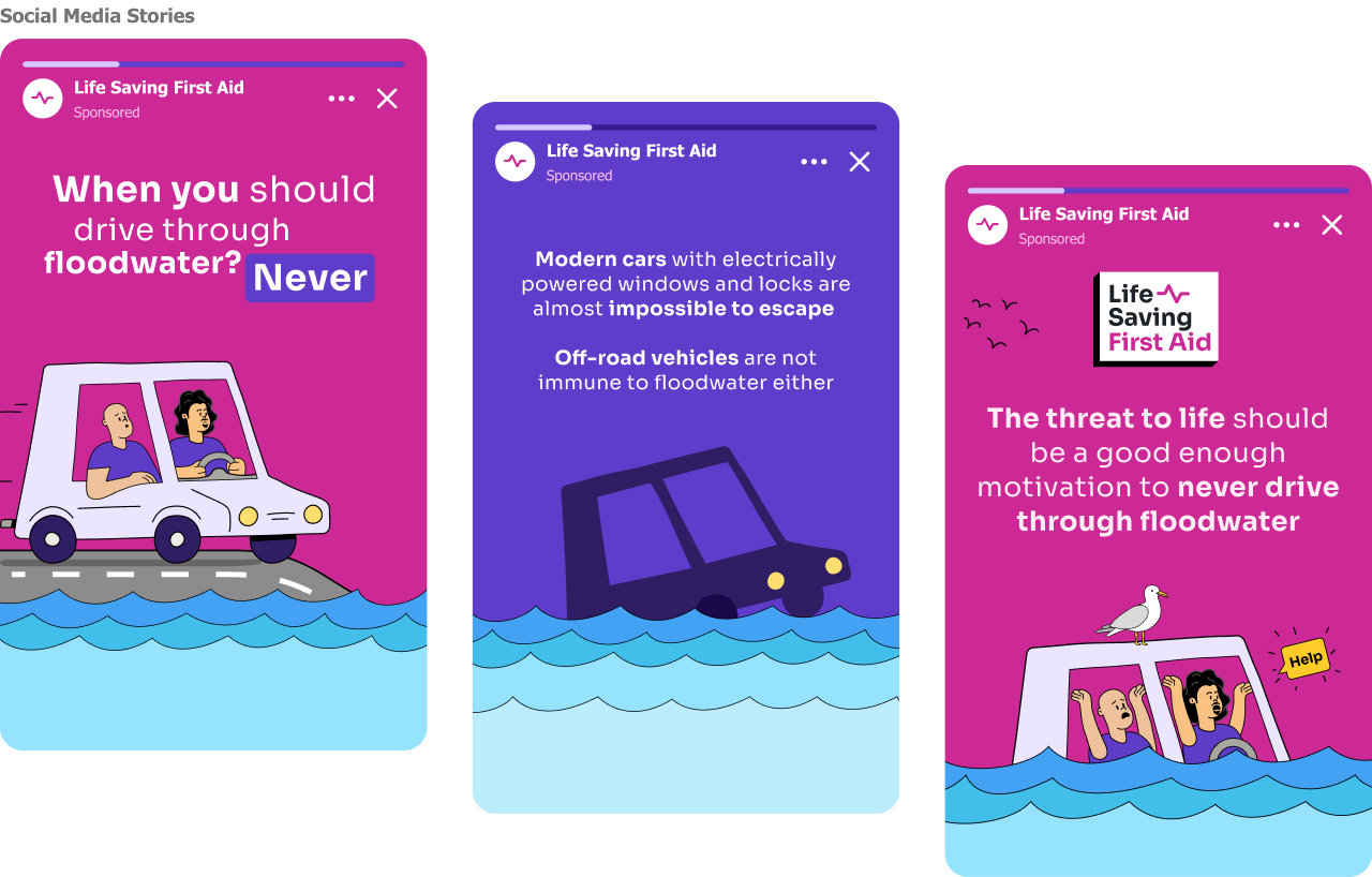
Expanding brand reach and SEO with social media
Efforts have been dedicated to enhancing social media communication as an essential tool for expanding brand reach. People quickly engage with compelling content and adopt a brand's online presence. This engagement substantially improves the brand's SEO scores.
Efforts have been dedicated to enhancing social media communication as an essential tool for expanding brand reach. People quickly engage with compelling content and adopt a brand's online presence. This engagement substantially improves the brand's SEO scores.
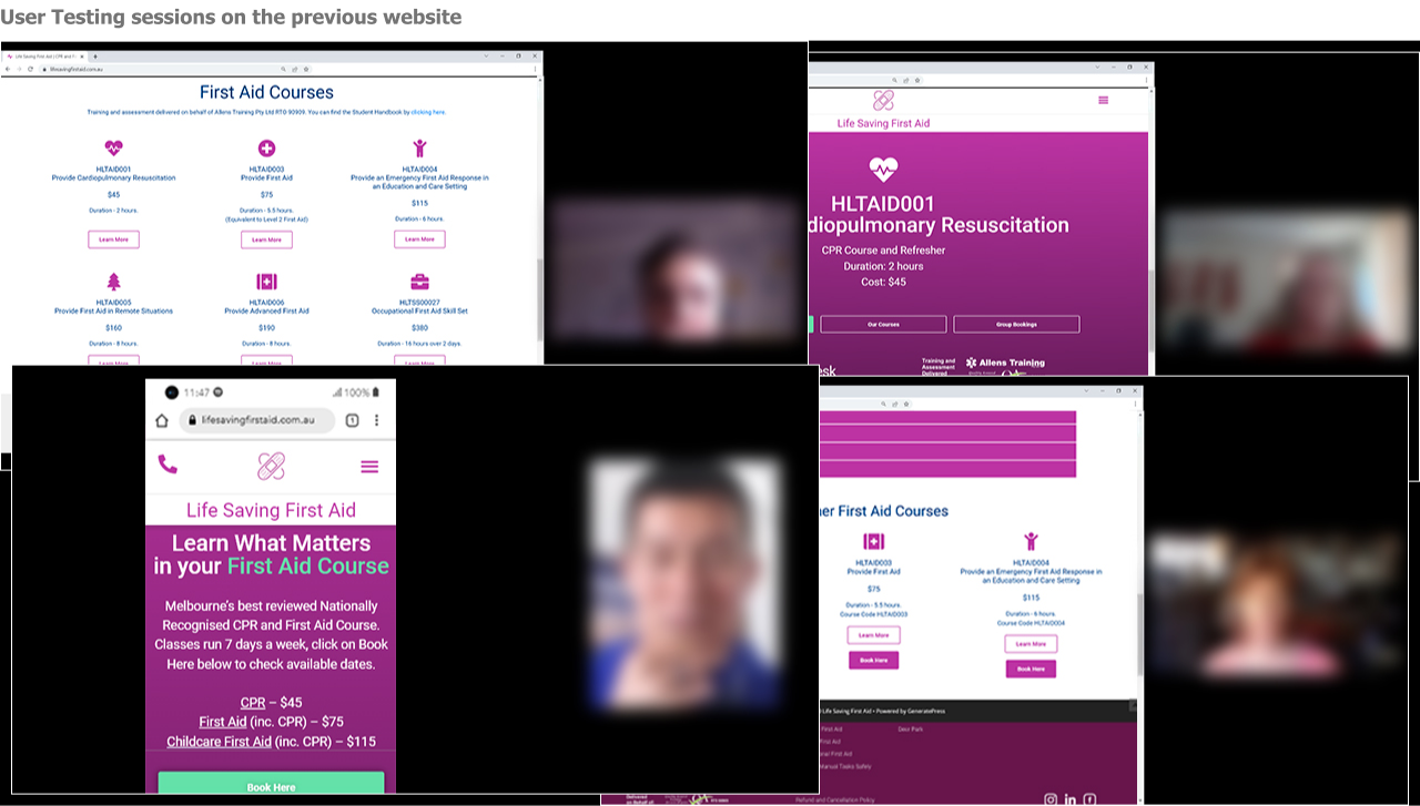
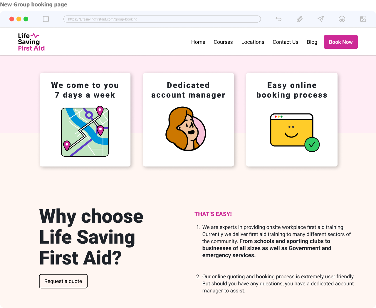
Identified Website Problems with Usability Testing
I conducted 10 sessions of user testing, on the previous website. Users encountered frustrating issues such as slow loading times, broken pages, and confusing navigation. I redesigned the user flow and had a solution sketch session with stakeholders. Then, I crafted wireframes prioritizing the "Book Now" call-to-action and then created the High fidelity prototypes using Figma. The result was seamless user journeys with relevant information displayed prominently and including the new branding.
I conducted 10 sessions of user testing, on the previous website. Users encountered frustrating issues such as slow loading times, broken pages, and confusing navigation. I redesigned the user flow and had a solution sketch session with stakeholders. Then, I crafted wireframes prioritizing the "Book Now" call-to-action and then created the High fidelity prototypes using Figma. The result was seamless user journeys with relevant information displayed prominently and including the new branding.
Check the new website at the following link
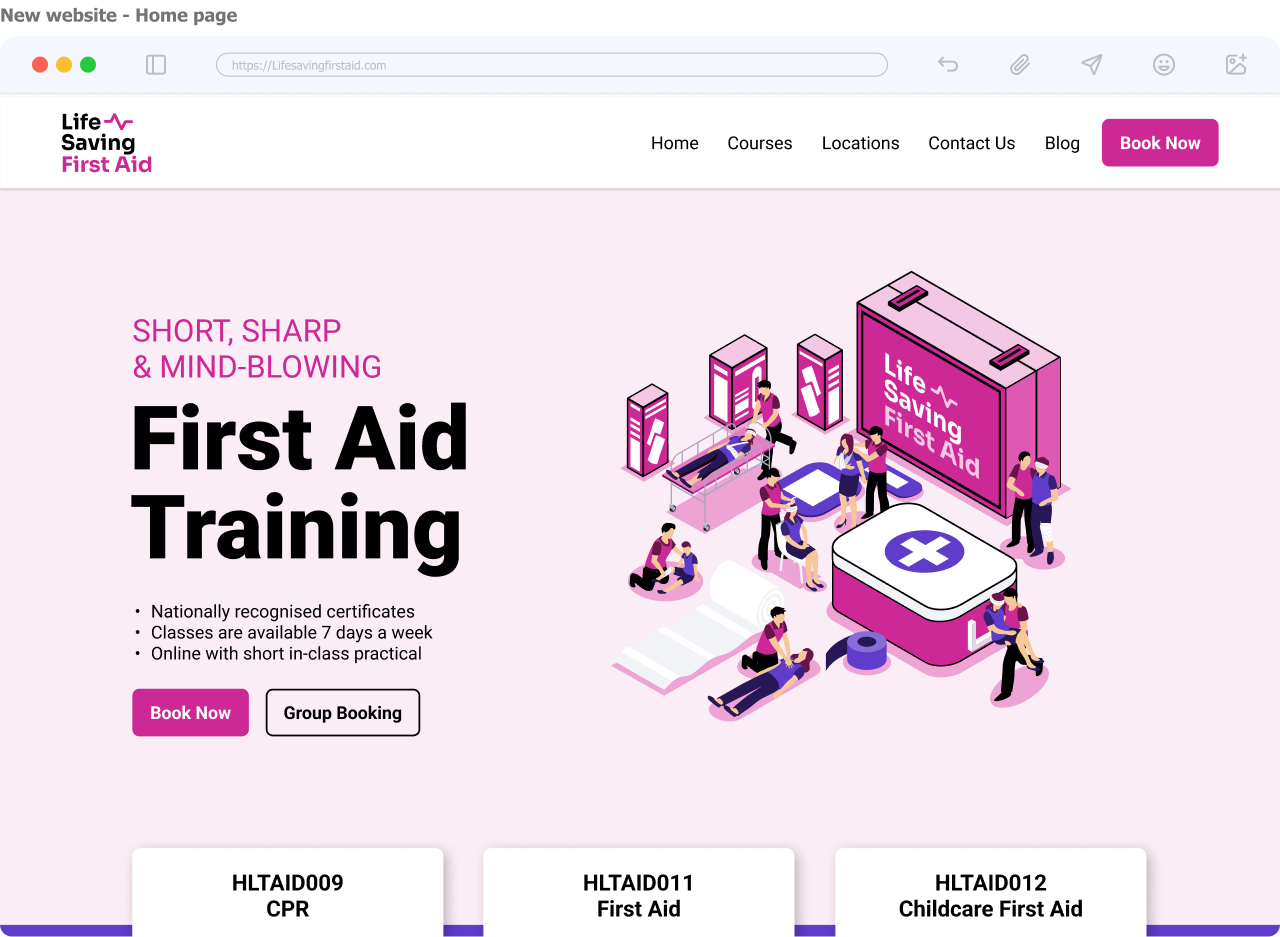
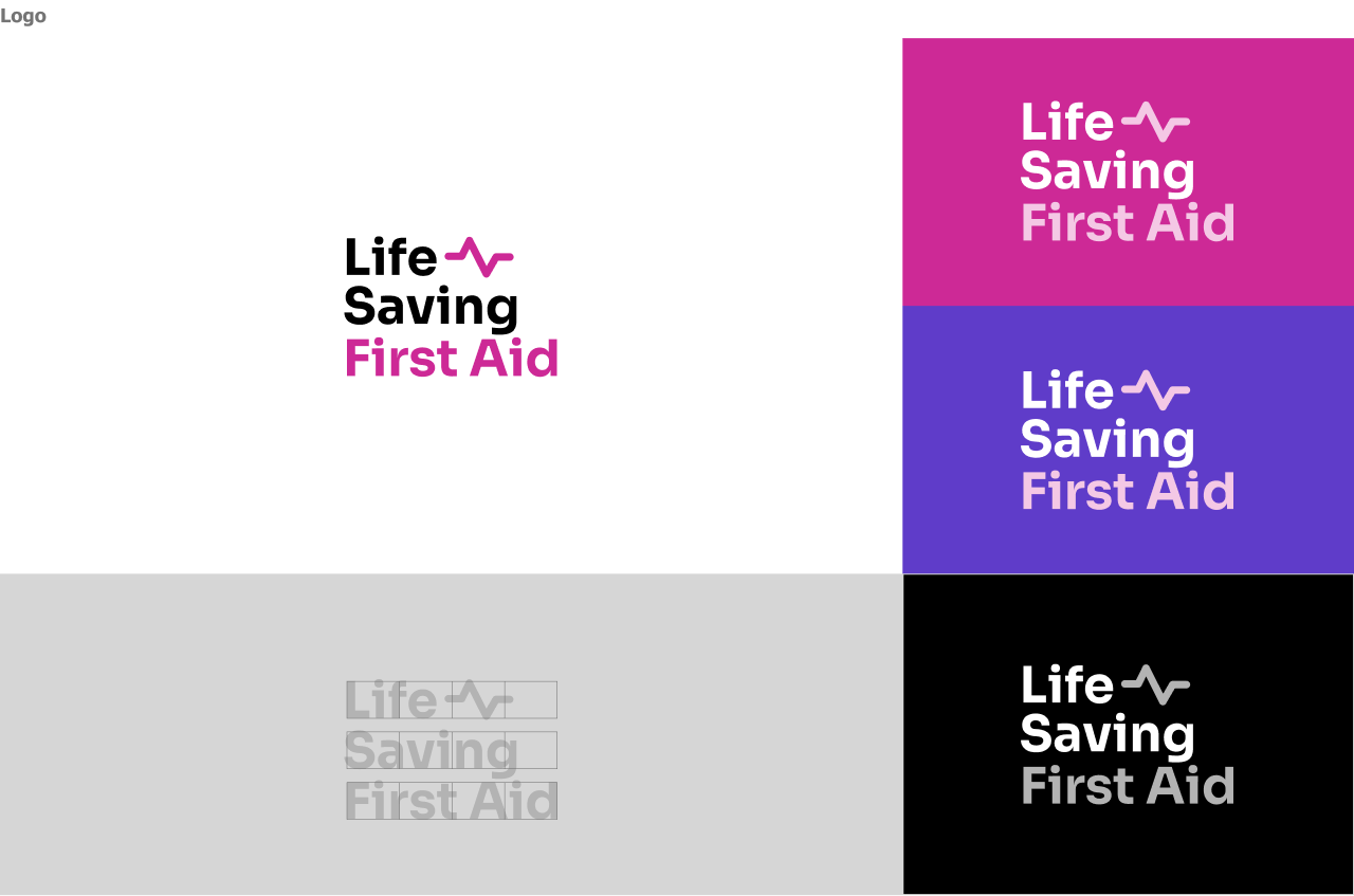
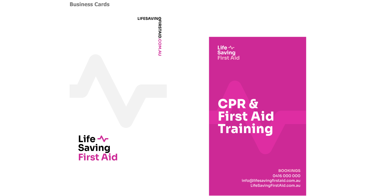
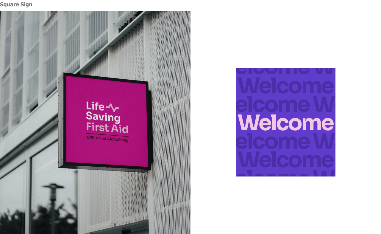
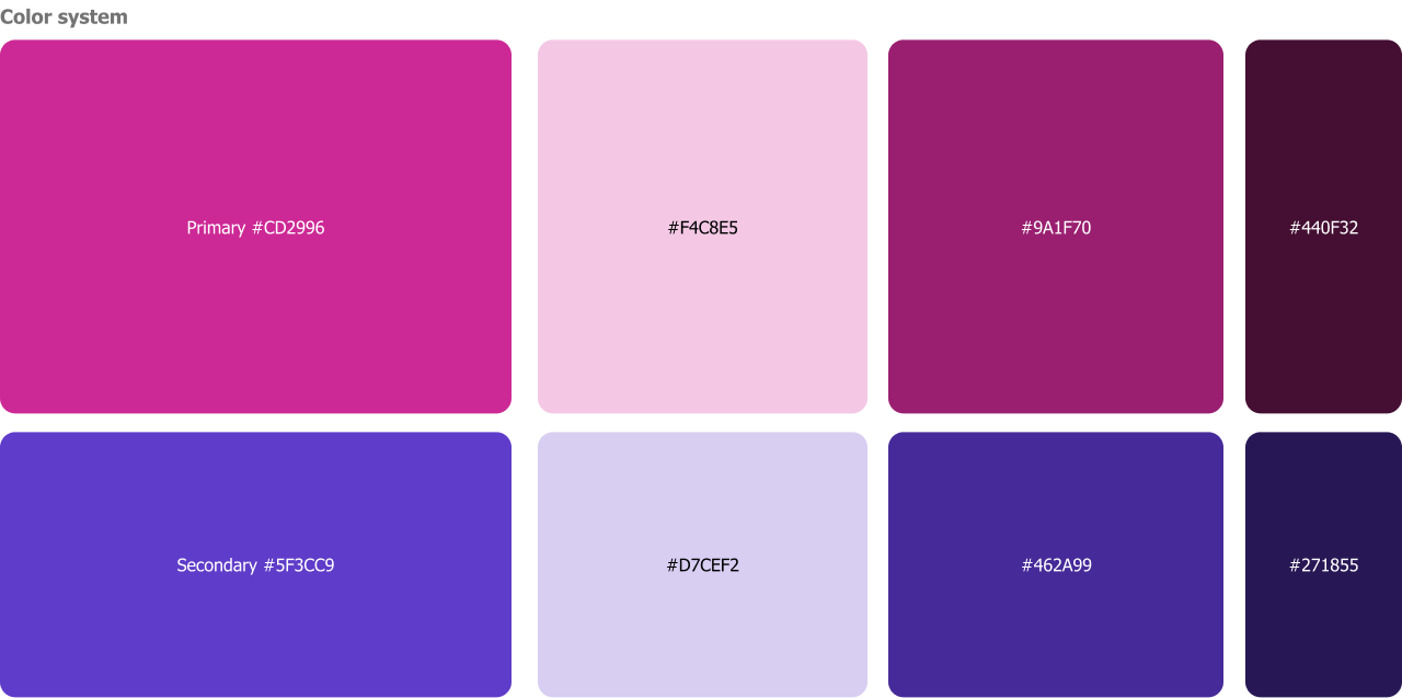
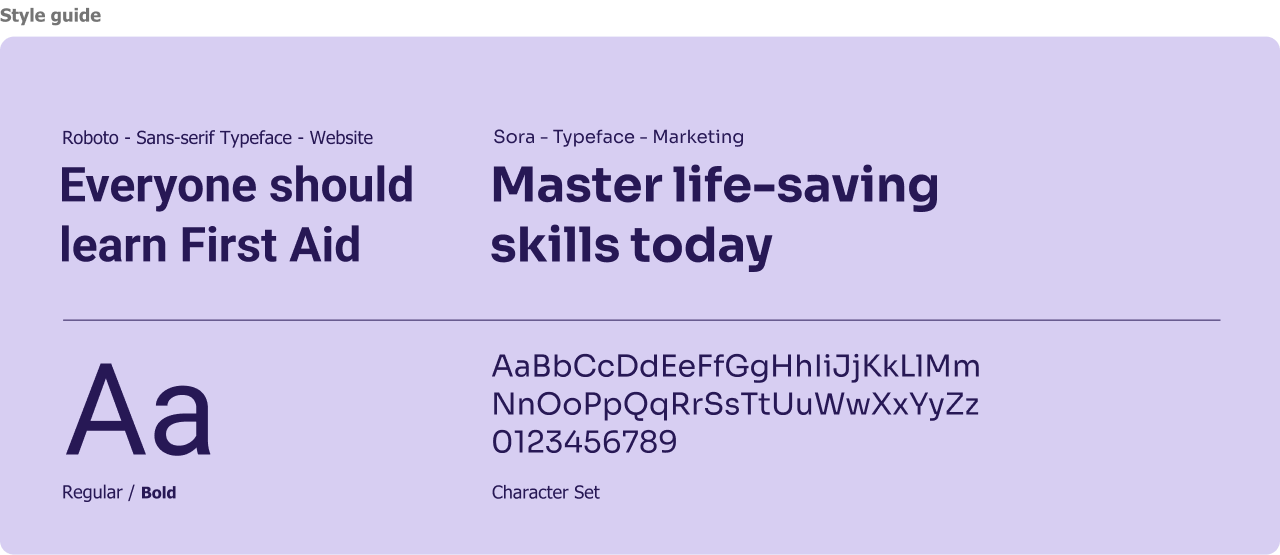
Vibrant and Bold: The Pink and Purple
Pink, a bold and striking choice, proves to be an ideal match for the target audience especially as many customers referred to the company as “the pink guys”. Many competitors used white and red or white and green, for us Pink and Purple take the spotlight as the primary and secondary hues in the palette. As for typography, the website adopts the contemporary "Roboto" typeface, renowned for its versatility and extensive range of weights. For Marketing purposes, we used “Sora”.
Pink, a bold and striking choice, proves to be an ideal match for the target audience especially as many customers referred to the company as “the pink guys”. Many competitors used white and red or white and green, for us Pink and Purple take the spotlight as the primary and secondary hues in the palette. As for typography, the website adopts the contemporary "Roboto" typeface, renowned for its versatility and extensive range of weights. For Marketing purposes, we used “Sora”.
The redesign proved to be a game-changer
This journey has breathed new life into the brand. The website became a powerful tool for attracting new clients, generating leads, and driving conversions. The introduction of a new illustration style and brand voice yields impressive results, tripling the social media audience within a month.
This journey has breathed new life into the brand. The website became a powerful tool for attracting new clients, generating leads, and driving conversions. The introduction of a new illustration style and brand voice yields impressive results, tripling the social media audience within a month.


